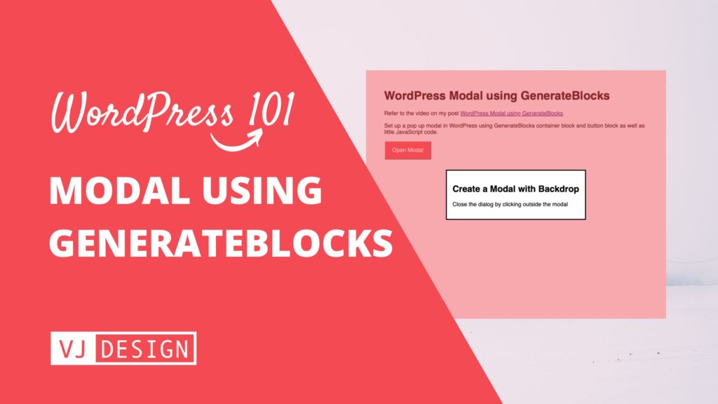
Build an amazing WordPress modal popup using GenerateBlocks Container and Button blocks. The modal will be easy to edit, responsive, accessible and visually appealing. You can set one up in just 5 mins!
GeneratePress theme (and GenerateBlocks) does not come with a pop modal by default. The theme author believes that not everyone would use it and it adds a decent amount of CSS. I agree! Most modal plugins add a lot of code and may end up slowing your website. I also realise that most popups are poorly designed and not fully accessible.
Is this modal accessible? performant?
We are using the default <dialog> HTML element to generate this modal pop up. It works in all modern browsers.
Click outside to close this modal
Watch this short video to see how you can set up a pop up modal using GenerateBlocks.
To create a model that you can open and close by just clicking a button, we will use GenerateBlocks and a little bit of CSS and some JavaScript. Refer to the video above and instructions below.
Add a popup modal to a page, post or GeneratePress Element (to display site wide).
1. Create Modal Container Block
Add a GenerateBlocks Container block and style it as required. Ad required content within.
Click on Document Overview (1), select the Container Block (2) and from Advanced section, add a modal class (3).

2. Create the Open Modal button
Add a button and style it as required.
Click on Document Overview (1), select the Button Block (2) and from Advanced section, change the type to <button> (3) and add a openmodal class (4).

3. Add the JavaScript Code to show/hide the modal
Add a Custom HTML block (2) and add the JavaScript and CSS code required to create the show/hide pop up.

Copy-paste the script and styles below into the Custom HTML block.
<script>
// Find container with class="modal" and convert its <div> into <dialog>
const modal = document.querySelector(".modal");
const dialog = document.createElement("dialog");
dialog.innerHTML = modal.innerHTML;
modal.replaceWith(dialog);

const openDialog = document.querySelector(".openmodal");

// Opens the modal when button is clicked
openDialog.addEventListener("click", e => {
  dialog.showModal()
})

// Close the modal when clicked outside modal
dialog.addEventListener("click", e => {
  const dialogDimensions = dialog.getBoundingClientRect()
  if (
    e.clientX < dialogDimensions.left ||
    e.clientX > dialogDimensions.right ||
    e.clientY < dialogDimensions.top ||
    e.clientY > dialogDimensions.bottom
  ) {
    dialog.close();
  } else {

  }
})
</script>
<style>
dialog::backdrop {
  background-color: rgba(243,74,83,0.5);
}
</style>
Is this modal accessible? performant?
We are using the default <dialog> HTML element to generate this modal pop up. It works in all modern browsers. My code converts the <div> element in the Container block into <dialog> block. If the JavaScript fails to load, the contents would still display.
Want to display another modal on the page, simply duplicate the code – see this codepen.


I am very sorry. But I am not getting it to work. What could be my problem?
Thank you Vijay, that is a great solution!